Sometimes, making design choices, whether decorating your home with accent pillows or building stunning, massive built-ins for your dining room — is easy as eating ice cream on a hot summer day. Other times, knowing EXACTLY the right thing to do is … clear as MUD. Today, Val is having a touch of trouble deciding what she likes, loves, or simply can live with. So I suggested we let you all weigh in and see what you think.
Do you remember Val’s dining room project? She is moving right along. Lower cabinets are done. Countertop is installed, outside upper cabinets are installed but the middle section is where the project comes to a halt until a decision can be made.
Or do you like the idea of hanging a big sign right in the middle? I’ve got an idea for that!

Anyway…
My original sketch had three separate cabinets in the middle section. Well, as is prone to happen in the middle of a project , this design had to change — because of the unfortunate placement of a very large intake vent on the wall. (More on the awesome way we solved that problem later…)
Instead of three cabinets, the middle base was built in two sections. The problem is that with two large sections on the top, the shelves will sag. It’s too wide a span to just have two sections and be done with it. That WOULD be too easy. We have to get creative. Val and I have come up with four possible choices.
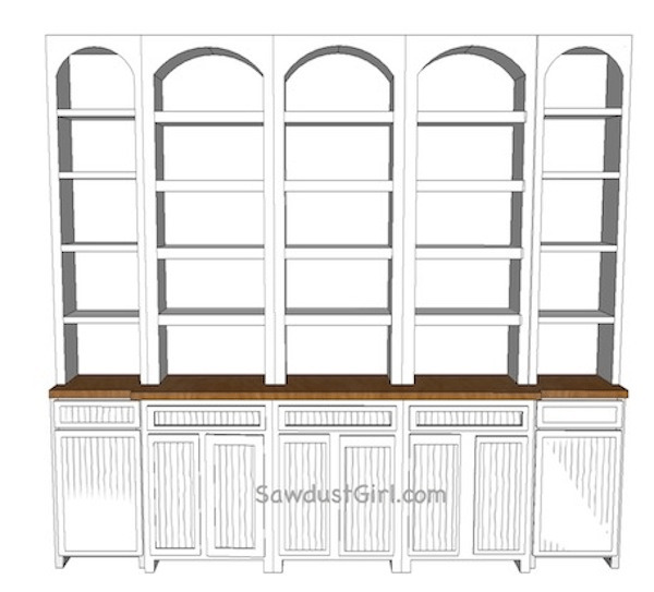
Option 1: Six small sections
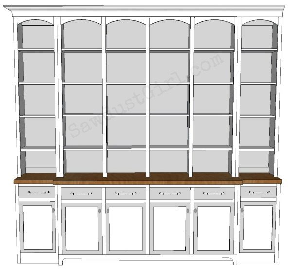
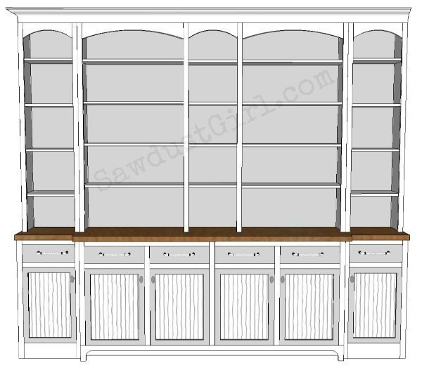
Option 2: Two sections with columns. (The shelves are too wide to not sag without the columns…herein is the problem.) 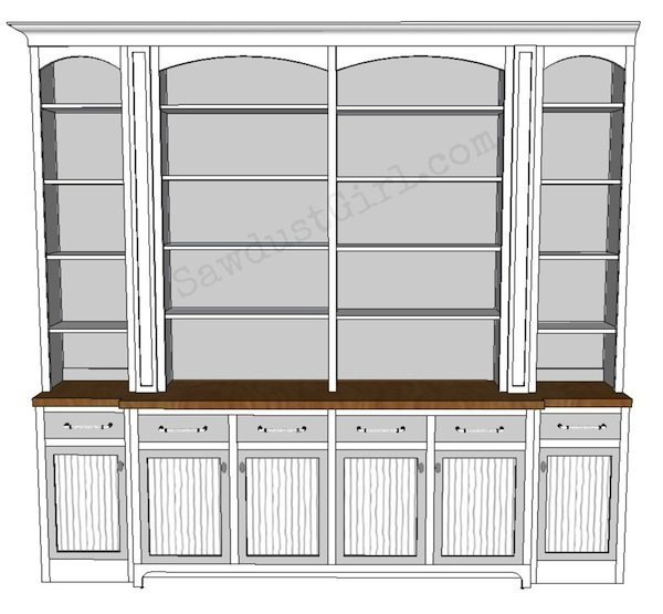
Option 3: Two wide sections with wine storage.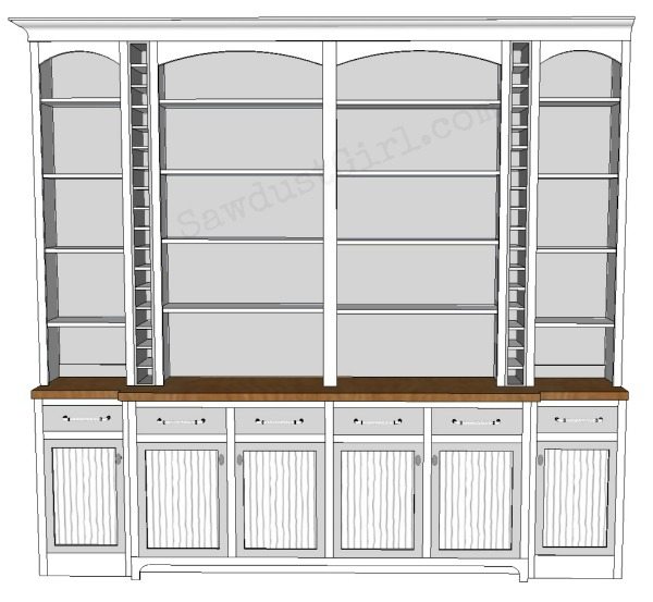
Option 4: Two wide sections flanking a narrow section that mirrors the end cases.
I’m not saying a word about which one I would choose.
Sometimes, when you’ve been working on something for weeks and weeks, everything starts to blur and you need a second opinion.
‘Cause it gets hard to find your way when your vision is blurry and all you see is arrows pointing in EVERY direction.
So, which one would YOU choose?
See what she went with in part 4!
Jennifer Rinck says
Option 2!! Keep in mind the that all of the shelves will be filled with items – you don’t want it to look too “busy” when decorated. The wider shelves give you the option for larger decor. One of the greatest tips I was ever given when going through my design classes – Decorate; Breathe; Decorate; Breathe – every space does not have to occupy something :-).
I absolutely LOVE seeing the progression of all of your projects!!! I hope to have my own projects progression to post this summer…
Lori says
I like option #2.
Leigh says
Option 2 is my favorite by far. The other options look very busy and chopped up to me. Option 2 is most pleasing to my eye! Good luck. I wish I had an audience to bounce my ideas off of!
Ann Marie @ Twice Lovely says
All your choices are great, but my preference would be #3 with the wine storage.
debbie r says
so u can’t put two shelves up top and a mirrored section on the bottom? 🙂
The only difference is 2 and 3 is the place for wine. So the question is, does she drink and does she want to look at wine bottles all day? if its not filled it would look like something is missing. Without the need for wine storage, i pick number 2, otherwise number 3. I think all the cubbie holes in number 1 would look too cluttered. You asked 🙂
Hillary @ The Friendly Home says
I like 2 & 4! Simplicity.
Stephanie says
I like option #2 the best and it also looks like the easiest to build, double score! Maybe if she needs wine storage she could build something into one of the lower cabinets?
Peggy says
I would want #2…..looks awesome!
Clayton says
Option #3! I think there are a lot of horizontal lines in the design, and having the wine storage columns provides nice vertical balance and is most pleasing to the eye. Also, the wine storage idea is unique and really elevates this design beyond simple cabinets and shelves. It will surely be the most talked-about, buzzworthy feature when it’s finished!
Jann Newton says
I really like option #2. It seems less busy. I like clean and simple styles.
Melanie Swank says
Option 4 is my favorite! Good luck
Jenn says
Option 2 all the way! I believe it has the best visual balance without being too busy. A beautiful looking cabinet! I’m jealous! I want one! ; )
Janet says
I like Option 2. The columns give the upper part some importance and emphasize the bump-out in the countertop.
Jen says
Option 2 or 4. The wine storage, while useful, looks visually messy to me. The 6 small cabinets seems less useful and also a little busy.
Deb says
I would pick option #2. The columns give it some additional texture and the expanse makes it less busy.
Julie @ follow your heart woodworking says
Can you please tell me the width of the whole wall (or unit) that you have there? And/or how wide each door is on the bottom. I am trying to design something similar and can’t decide how many sections to have, my wall is 10’2″ wide.
Bobbi says
I definitely like option 2 the best. How long would the shelves be? Couldn’t you add a little thicker piece of hardwood to the front and back of each shelf (covers the plywood edge, makes the shelf a little thicker than the 3/4″ and you can router a nice edge detail or even a simple 1/4″ round over looks good) this would add strength to the shelf.
Stephanie B says
I would most definitely choose option #2. IMO – Option #1 is too plain, Option #3 would be more difficult to dust and keep up with, and Option #4 just seems a bit much. When I saw Option #2 I could SEE decorating it with some small knick-knacks, a plant or two, some lovely books, and gorgeous dishes and platters. Oh, yea! <3!
Kat says
Option 2. As another poster mentioned, I think that option has the best visual balance. My second choice would be including the wine racks in option 3, but having so many cubbies means (at least in my house it would lol) a lot more things that would be stored in these little cubbies in addition to wine bottles. Things…aka “junk”. I could see my kids temporarily storing chapstick tubes, pens, setting anything aside for “just a moment” and having the little cubbies turn into permanent homes for their stuff and that would drive me crazy. So that is why I like option 2 best, and option 3 as my second choice.
Mehgan says
I would choose Option 2 or 4, 6 cases felt too many for Option 1 and I don’t drink wine so I personally wouldn’t choose 3 🙂
Option 4 feels the most balanced to me, though I like the thicker columns between the wide and skinny shelves in 2. Hard choice! If it was my room I think I would lean toward 4 only because something about it is just more pleasing to eye for me.
Can’t wait to see what you guys decide to do!!
Stan Pearse says
Option # 2
Kris says
I really like 2 and 3, I think 2 looks the best straight up BUT if you are partial to glass of vino and actually had bottles in the wine rack I think 3 would be just as good and maximizing the space too.
Maren says
I concur with everyone else. #2 with the columns, or #4 with the small center section. #2 being my favorite. I think the six small sections and wine storage is too busy. Can’t wait to see what she chooses!
Wendy says
I like the look of No. 4, that way she can still have space for large platters and smaller items, and it solves the expanse problem. Lovely!
gail says
option 2, classic.
Val Fitzpatrick says
Loving all of the comments, keep ’em coming! Y’all have no idea how helpful your input it. I was starting wonder if I had a case of the “JustGetItDone-itis” but your comments are showing me that is so not the case! ♥♥
kristin says
Number 2!!!! Simple, classic, timeless. #4 would be second choice if I had to. NOT #1–way too busy with all the tiny shelves and LIMITS your display choices! NOT #3 because even if I liked wine (or drinking–been there, done that!) I think it would look dated (at some point saying “why did I do that?”) and a little cheesy. Would detract from what you want which is a classic, timeless piece. Not “I like to drink wine and I want EVERYONE to see it!” Is that too much “speak your mind”?
Angel says
I like option 2 the best and I really don’t like option 3… but maybe that’s because I don’t drink wine but I think with only a few bottles in it it would look off balance.
Option 1 limits the size of items placed. Option 4 is ok but 2 is my favorite!
Linda says
I like 2 or 3 best. I think they are more balanced visually. I’d personally opt for 2, since I don’t have that much wine to display, nor would I favor putting it out there as part of my decor. But 3 has the same proportions, so…
Kristin says
#2
Kim says
#2 with Columns!
Kim says
Definitely Option 2!
Rhonda says
#2 appeals to me the most, the shelve size gives the most option for display and just looks the most symmetrical to me.
Deb C says
Hands down #2. The best option of the four.
Cathy J says
Option 2, no question!
Tina says
EASY….Option #2! love it!
kathy says
just because i have to be different, i like #3…. 🙂
Cheryl says
I like option #2 the best, the middle shelves are bigger and I would think more useful in the end. But option #3 isn’t that bad either. I would just put in less wine bottle shelves…it just looks too cluttered to me and I would match the wine bottle shelves to the shelves on the sides…it would look more aligned with the other shelves. Good luck!!!!
Tam says
I like 2 or 4. Mainly because there’s more room to put food on the buffet if needed, but there’s plenty of room for display.
Diana says
I also like #2 best. The option for wine is nice, but I wouldn’t have that many bottles to make it worth while..I’d drink half of what I have just getting this project finished!! LOL
Sandra says
#2 here as well! 😉
Sandy R says
Option 2
Linda S. in NE says
I will be chosing Option #2. Aren’t you the little lady who was just teaching us the miracles that could be accomplished with moldings and trirmwork ? #4 was a contender for a short while, but there is just something weird looking about the upper curved area at the top center. Option #4 is too cut-up looking, and just think of dusting over and around all those wine bottles.
Stacey says
I like Option #3. Maybe because I don’t have bottle storage myself.
Erica says
I’d go with 3, the wine storage is awesome!
Kat says
#2 for sure!
Lisa E says
#2 all the way!
Cara says
Option #2
Brittany @ Brittany's Joy says
Ooh I like option 4!
Cathy Michels says
I would do option 3 with the wine storage, but put doors on them that look like the front of the columns on option 2. Hidden wine storage. You get the storage without the dust!
Guerrina says
#2 here!
Diana W. says
I love the last option. Not a wine drinker and find so many bottles in view is to much visual clutter. Same for not having a number of smaller cubbies. For my time and effort it would be #4 with #2 being a close runner up. Anyway yall choose to do it, I’m sure it will be fabulous! Can’t wait to see the finished product!
Janet says
I like options 3 and 4. I’m looking forward to seeing the final product 🙂
Beth says
#2 for sure! It looks the cleanest. They would all be pretty, but #2 just looks right to me.
Jen in Jersey (soon to be Texas) says
I’m leaning toward option 1, but I’d love to see an option that marries 3 and 4 – one that has a third column of wine storage in the middle!
Kathleen says
I love #2. #1 is too busy and I’m not crazy about the little middle section in #4
Mary says
Either 2 or 3 (if you’re a wine drinker and need an attractive place to store bottles). Can’t wait to see the finiushed cabinets.